It’s no secret that the housing shortage is one of the greatest challenges that Britain faces – and, indeed, one of the biggest reasons why young voters have rejected the Conservative Party in such numbers.
When I started speaking to the Tory MPs who are taking part in the Centre for Policy Studies’ “New Generation” project, I was struck by how many of them brought up housing as the number one issue that the party needed to tackle.
Which is why I’m delighted that one of our opening papers is a properly meaty look at the issue. In “Homes for Everyone”, Croydon South MP Chris Philp examines not only what’s gone wrong with the housing market, but just why home ownership is so important both socially and economically.
To that end, his recommendations aren’t just about planning reform but how we can tilt the market towards the people it should be serving – ie first time buyers rather than second home owners, buy-to-let landlords or foreign investors looking for a place to park their assets. One proposal that’s already making waves is his idea to reserve half of all new-build properties for British citizens, or those who pay their taxes here – a plan The Sun, delightfully, dubbed “Brits ‘n’ Mortar”.
But as well as a guide to what to do next, Philp’s paper also serves as an excellent primer to what’s happening in the housing market. Here, then, are the graphs which explain pretty much everything you need to know – and why you should be so alarmed about it.
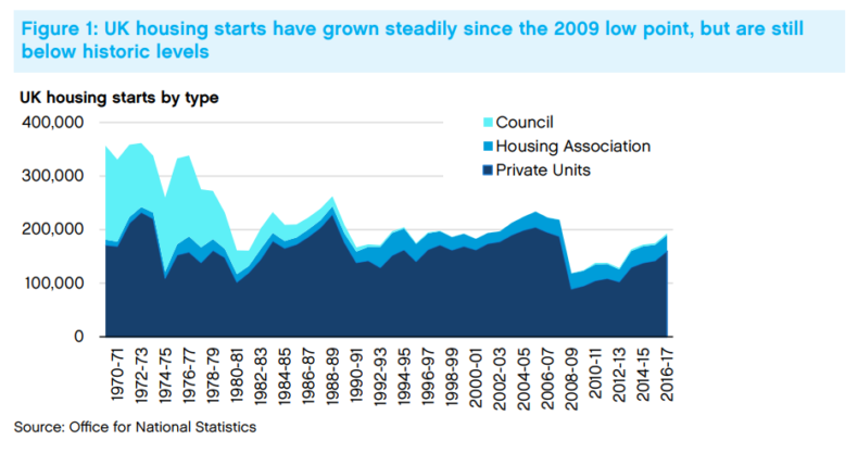
A pretty simple one, this. We used to build enough houses. Now we don’t. Partly, that’s about the fall in council house-building from the 1980s onwards. Partly, it’s about the aftershocks from the financial crisis. And partly it’s about population growth – over the 40 years from 1960 to 2000, it was expanding at roughly 115,000 per year. In the years since, the growth rate has been 415,000 a year, thanks in part to immigration.
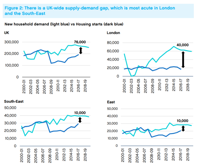
Britain does not – as Ian Mulheirn has pointed out on CapX – have a national housing shortage. We have a series of regional ones – concentrated in particular in London and the areas around it, where the gap between household numbers and houses built is cavernous.
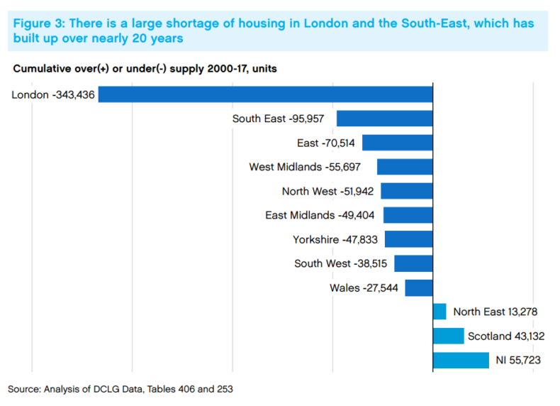
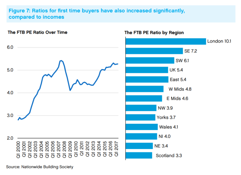
Over the years, these supply gaps have built up to the level below – reflected in the changes in house prices in the various regions.
But household numbers alone don’t tell the story – because one of the effects of unaffordable housing is that people stay with their parents. Or, in the case of many immigrant workers, cram themselves 10 or 15 to a household – or even a garden shed.
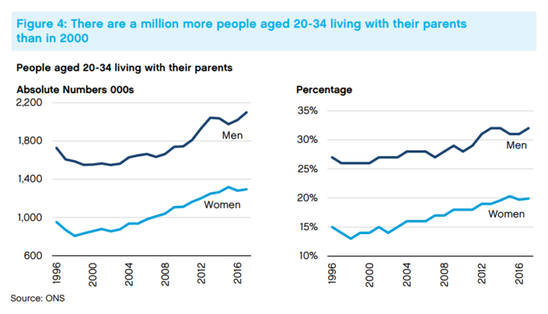
The full drama of this chart can be hard to appreciate. But what it’s showing is that since 2000, a million more young people (far more of them men than women, for whatever reason) are living with their parents. Since 2008, the total is 600,000. That’s a colossal slice of the population who should be moving on to their own homes, but aren’t.
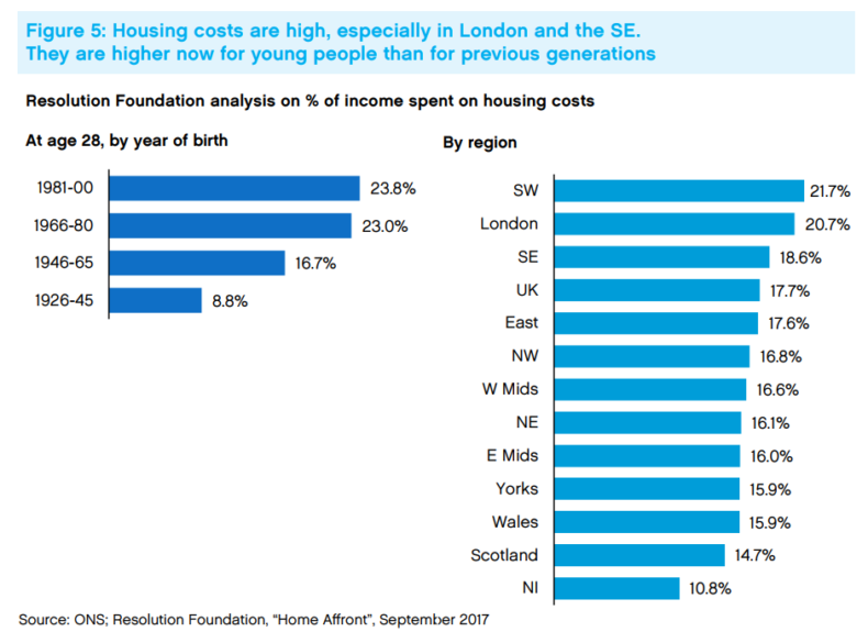
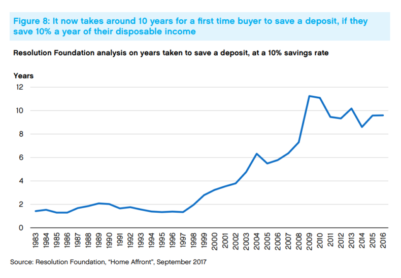
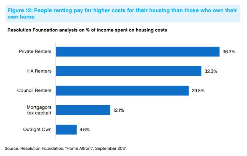
The result of this undersupply is that, whether you rent or own, you’re having to pay more for housing. In London, rental costs can now be around 40 per cent of salary for some young people. This is not only far more than previous generations paid, but makes it ever harder to scrape together the money for a deposit.
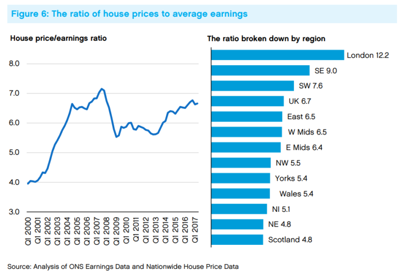
In London, as the chart above shows, the affordability ratio is now over 12 times salary – which given that banks will only lend five times salary means it’s effectively impossible for normal people to buy houses.
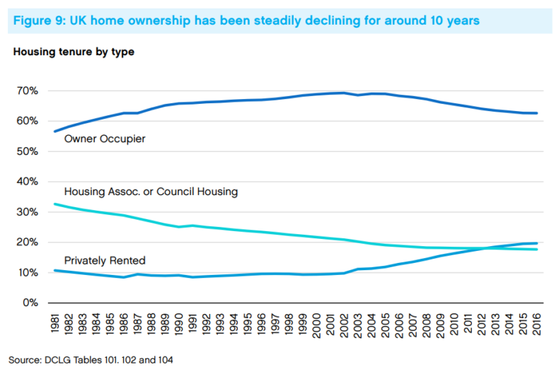
The result of all this is that home ownership is now declining – about 8 per cent of the population who should be owning are now renting.
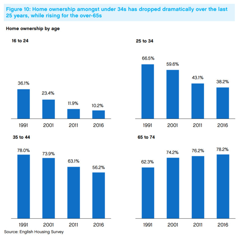
And those effects have been concentrated overwhelmingly among the young. (It’s no coincidence that those groups which have seen collapsing home ownership, the under-44s, are also those who are more likely to vote Labour than Conservative.) The figures are even more dramatic when you consider that “16 to 24” covers lots of teenagers who would never have owned houses anyway – so the fall in home ownership among twentysomethings has been positively vertiginous.
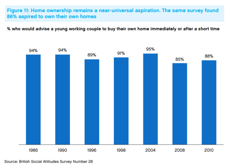
Home ownership, as Philp points out, is still overwhelmingly popular.
And it’s still a great deal. Setting aside the costs of paying down your mortgage, it’s far cheaper to be an owner than a renter. Even when you add those costs in, it’s still better value.
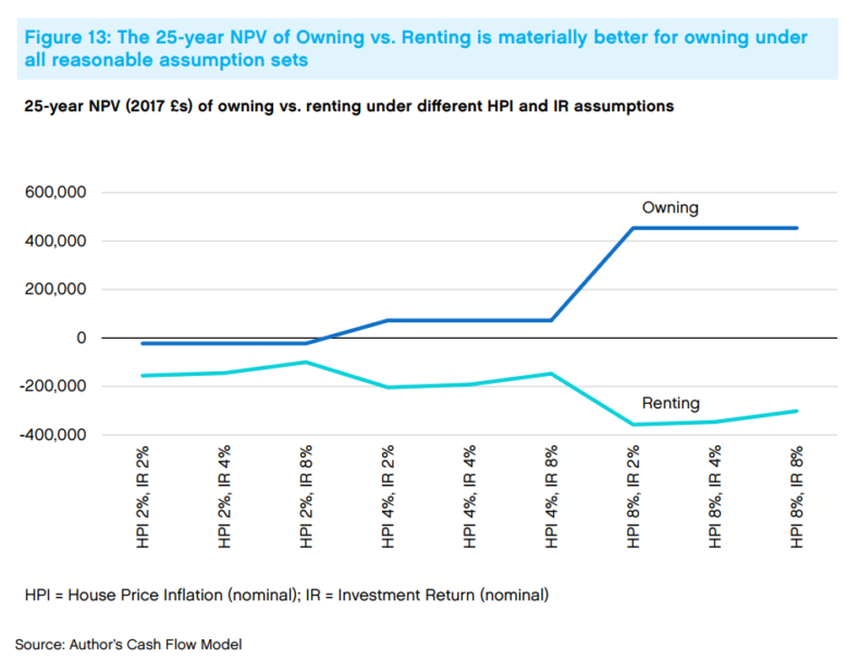
In fact, Philp has crunched the numbers, and over a 25-year period, owning always leaves you better off than renting under any conceivable set of circumstances. Even if there is absolutely no growth in real house prices, and the stock market turns what would have been your deposit money into an absolute fortune, you would still have been marginally better off investing in bricks than shares. The moment decent house price growth kicks in, the gap widens to the hundreds of thousands.
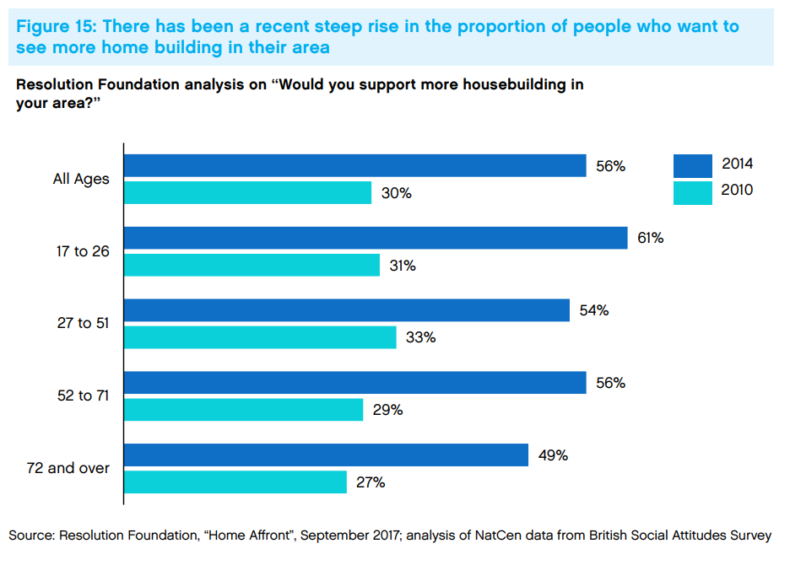
So what can be done about it? I’ll leave that to Philp’s paper to explain. But one striking finding from the Resolution Foundation offers some hope: people of all ages are suddenly realising the scale of the problem, and are becoming more inclined to support local housebuilding.
Back in 1975, Margaret Thatcher announced in her very first speech as Tory leader that she intended to make Britain a property-owning democracy. If we want to keep that dream alive, we’d better get building.
