The poverty researcher Martin Ravallion spent decades researching how poverty can be measured and which policies can help us in our fight against poverty. The summary of his work is his monumental book ‘The Economics of Poverty: History, Measurement, and Policy’.
The first chapters of this book present a detailed history of global poverty and how the research of poverty has developed. The very big-picture of the long-run decline of extreme poverty he summarizes in the following figure. The chart shows that over the last two centuries global poverty declined continuously.
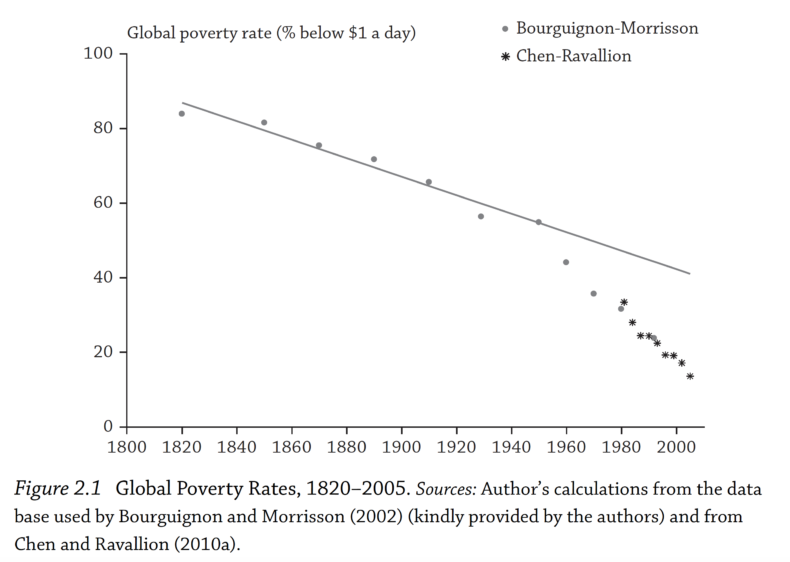
But what is this chart based on? How do we do know that the vast majority of the world population lived in extreme poverty just two centuries ago as this chart indicates? And how do we know that this account of falling global extreme poverty is in fact true?
It is the research of hundreds of historians who have carefully assembled thousands of estimates that give us this global perspective on the history of poverty.
In public discussions of the history of poverty the extent of this careful work is often overlooked. Such a deceptively simple chart on the global decline of poverty may then be easily dismissed as being based on little, or even no evidence. This is a mistake.
In this post we want to explain the methods used by researchers to estimate poverty consistently over time. We cannot provide a complete overview over a large field of research in a short post, so we have put together a list of books and research papers below this text to give you a starting point into this important academic literature. As always, more detail is provided in our entry on extreme poverty.
How do we estimate global poverty over time?
In recent decades, it has become routine for countries to conduct household surveys that record the level of income or consumption of a representative sample of households. From these samples, poverty rates can be estimated for the whole country. A team of development researchers at the World Bank around Francisco Ferreira brings these national surveys together in order to make an estimate of the global poverty rate. These global estimates go back to 1981 and these are the figures we use in our chart of long-run global poverty from that year onwards.
To study earlier periods, before the broad adoption of household surveys, a different approach is needed. Here researchers rely on the ‘national accounts’ method, in which poverty estimates are derived from economic historians’ reconstructions of prosperity and inequality at the time.
If that sounds like a rather heroic task, that’s because it is. It is only thanks to decades of cumulative, systematic and painstaking historical research that we are now able to have a detailed understanding of the economic history of the world over the last centuries.
Below we will look in some detail at how researchers go about estimating income levels in earlier periods. In doing so we will get an idea of the many sources of uncertainty present in this endeavor. But what should also become clear is the solidity of the overall conclusions. Over the last two hundred years incomes rose and extreme poverty fell.
Misunderstandings
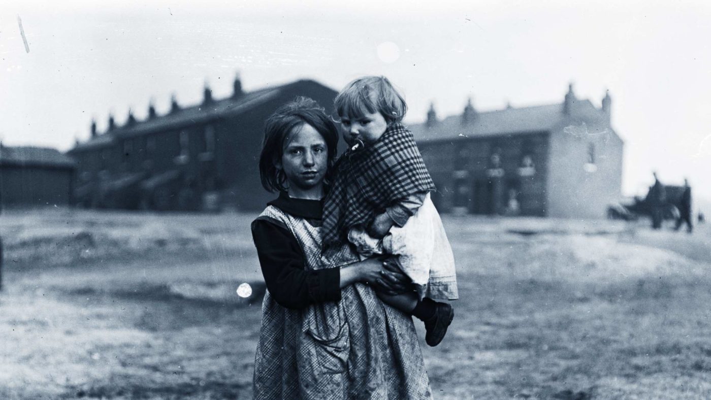
Firstly, it’s important to get clear from the outset that the poverty represented in the chart does not just concern the amount of money people had in the past. This is a common misunderstanding that is often at the heart of misinformed critiques of historical research. For instance, in a discussion of our global extreme poverty chart on reddit, one user suggested that it was “indicative of the fact that quite a lot of the world was enslaved to Colonial powers or did not use fiat currency.”
This interpretation is absolutely incorrect. Yes, over the last two hundred years, there has been a major shift from people farming for their own consumption towards people working for a wage and purchasing goods in the market. But historians know about history and this is not at all what is driving the fall shown in the chart. Where non-market sources of income make up a substantial part of total income, it is very obvious that money would represent a rather silly indicator of welfare.
Just as we need to adjust for price inflation, accounting for non-market sources of income is an essential part of making meaningful welfare comparisons over time. The poverty estimates account for both market and non-market sources of income, including the value of food grown for own consumption or other goods and services that enriched the lives of households without being sold in a market.
This issue is not just of importance for historical estimates, but it is also of central relevance for poverty measurement today, given the importance that food produced at home, or otherwise received in-kind, continues to play in the incomes of the rural poor, especially in low-income countries. Accordingly, these flows are accounted for in household surveys of both consumption and income, and in the historical estimates.
The research of economic historians – the UK as an example
So how do economic historians go about estimating incomes in the distant past?
In broad terms, the strategy is to extend back to earlier periods the system of national income accounting countries used today to estimate GDP consistently over time and across countries. In the absence of data collected at the time, researchers have to bring together what evidence they can from historical sources. But the basic principles are the same.
In particular, one very important principle to bear in mind is the fundamental identity in this historical accounting: “Within the methodological framework provided by national income accounting, the estimation of GDP can be approached in three different ways, via income, expenditure and output, all of which ought to yield broadly similar results.”1 In the important case of the subsistence farmer for example, the value of the food they produce represents both the economic output of the activity and the income received by the farmer. Consumption of that produce then represents a form of expenditure, as it is using up part of the farmer’s income.
Because of this identity the measurement of GDP can be approached from any one of these three angles: output, income, or expenditure. For historical estimates, the output approach is often considered the more reliable in practice given the available evidence, though information on incomes and expenditure still provide benchmarks to cross-check the plausibility of estimates.
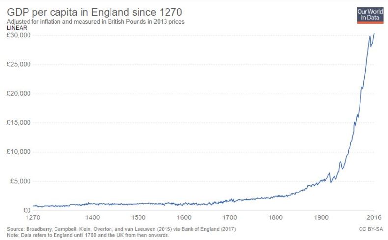
A good example of this output approach is the extensive work carried out by Stephen Broadberry, Bruce M. S. Campbell, Alexander Klein, Mark Overton, and Bas van Leeuwen to produce the historical GDP per capita series for England shown in the chart below.
The methods used are explained in detail in their book ‘British Economic Growth 1270–1870’.
It’s important to get across the level of detail that goes into such estimates although this is hard to do in a short overview like this one. Whilst, there are indeed many sources of uncertainty in such a process, it would be very wrong to think that historical GDP estimates are based on flimsy evidence. It is recommended to read this work in full length, but a passage on agricultural output gives some insight already.
“[The output method] has entailed, first, estimating the amounts of land under different agricultural land uses… and, then, deriving valid national trends from spatially weighted farm-specific output information on cropped areas and crop yields and livestock numbers and livestock yields… The latter task is further complicated by the need to correct for data biases towards particular regions, periods and classes of producer.”
And below is one of the many tables from this book, showing the authors’ estimates of output of just one part of the agricultural sector of England. This is one of hundreds of datasets that underlie are required to construct the time series in the chart above. And this table – and all others – in turn build upon a substantial body of historical research, as is suggested by the list of sources it cites.
There are two key takeaways. First, that historical reconstructions of GDP are the outcome of very serious academic work. Second, these represent estimates of total output, not just that part of production sold on markets. It is absolutely incorrect to think that these GDP series do not account for the value of non-market production, including domestic production for households’ own use.
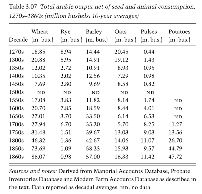
A table from Broadberry et al. (2015) showing estimates of historical arable output in England
Global economic growth over the long run
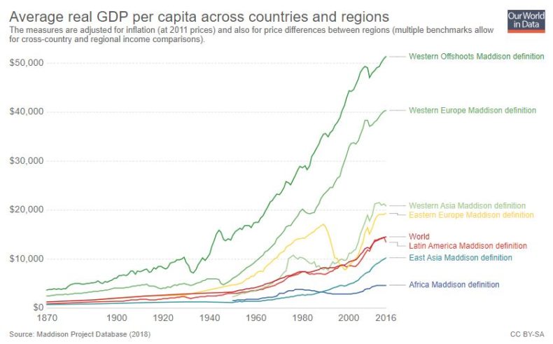
The extreme poverty estimates prior to 1981 shown in the first chart are taken from the famous research paper of Bourguignon and Morrison. Their estimates are based on a reconstruction of the global income distribution using the Maddison Project’s database of historical GDP per capita series for different countries.
Just a year ago this database was updated and now provides an excellent overview over this field of research. It draws together the research efforts of a huge range of country specialists, including the work on England just discussed. In different countries researchers employ different methods, depending on what historical evidence is available and is most reliable. But in each case the series are the outcome of serious scholarly research and are debated extensively within a large peer-reviewed literature. (See the list of references at the end.)
The chart below shows global GDP per capita as constructed from the Maddison database. What is clear is that economic growth is a reality – average income has increased by roughly a factor of ten over this period.
It is also worth keeping in mind that this change has happened while the world population increased 5-fold. Had total global production not increased, the GDP per capita would have declined 5-fold.
Economic growth and declining poverty
Knowing how the income of the ‘average’ person has changed is of course not enough to infer what has happened to poverty. To do this, research on the distribution of income over time is needed – not just growth, but also inequality matters for how poverty changes.
Just as the increase in average incomes over this period is very clear from the historians work, so too is the increase in global inequality. Whilst many Western European countries, the US, Australia, and Canada saw rapid economic growth throughout the 19th and 20th century, other regions lagged behind. It was only in the second half of the 20th century that low-income countries began to see growth rates comparable to, and eventually even higher than, those seen in rich countries. Many countries, particularly, but not only, in Africa, are still being left behind in terms of economic prosperity as the chart shows. Exploitative colonialism is one of the institutions that is to blame for these poor development outcomes, as we know from the studies of economic historians that rely on the work that is the topic of this text. If you are interested in this aspect of global history in particular we recommend Branko Milanovic’s book ‘Global Inequality’.
As well as reconstructing GDP estimates, economic historians also use historical sources to infer the extent of inequality within countries from historical sources. Putting these two components together allows us to construct the evolution of the entire global distribution of income.
The resulting picture of combining both aspects – average income and inequality – is shown in the visualization below. In this chart we can learn three things. Firstly, the overall volume of the distribution increases, representing the growth in world population, from around 1 billion to over 7 billion. Secondly, we see that between 1800 and 1975 the distribution of incomes in Europe shifted to the right and out of extreme poverty, whereas Asia and Pacific’s growing population remained mostly below the extreme poverty line. In recent decades, rising incomes in Asia bridged the divide between the two peaks of the global distribution visible in 1975. In doing so, hundreds of millions left extreme poverty behind and the share of the population living on less than the extreme poverty line declined. The chart is plotted on a logarithmic inequality and this need to be kept in mind when thinking about global inequality: economic inequality in the world today is vast, higher than in many of the most unequal countries in the world.
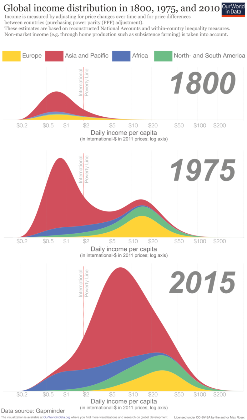
Global inequality in 1800, 1975, and 2015
Around 700 million people remain in extreme poverty today, as represented by the volume to the left of the extreme poverty line in the chart above. Indeed we see that a broadly comparable number of people are in extreme poverty today as in 1800. The difference is that in 1800 almost all the world’s 0.9 billion inhabitants were living in extreme poverty, whereas today this represents less than 10% of the world’s population.
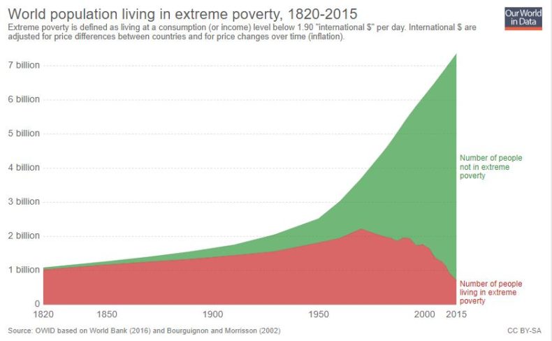
You can see this more clearly in the chart below. Clicking on ‘relative’ button shifts the chart from absolute numbers to percentages. Whilst the proportion of the world’s population living in extreme poverty has been falling consistently since 1820, it is only in recent decades that this has translated into a decline in the number of people living in extreme poverty.
Uncertainty
It’s important to recognise the sources of uncertainty in these historical reconstructions. By reading the work we list in the references below, you will get a sense of just how many steps are involved in the production of historical GDP estimates.
These uncertainties, however, should not be blown out of proportion. Whilst there are many debates in the economic history literature about which methods are most reliable or which assumptions are most plausible, there is no contention about the fact that average incomes have risen substantially across most parts of the world over the last two hundred years, and that the proportion of people living in extreme poverty has fallen.
Rising global inequality and population growth meant that, despite rising average incomes, the number of people living in extreme poverty was rising until relatively recently. But it is simply wrong to think of the story of the last two centuries as being one where the rich got richer and the poor got poorer. The poor also got richer. The absolute difference between the incomes of the world’s rich and the world’s poor have never been larger in the whole of human history. But neither have the absolute incomes of the world’s poorest.
How and why poverty lines are defined
Poverty metrics have several purposes. One is to provide an interpretable summary of what is happening to the material living conditions of the poorest. Setting the poverty line is a decision about how far down the distribution we want to focus our attention on – do we want to know something about the poor, the very poor, or the extremely poor? Another is to express a view or a social standard concerning the level of income needed to lead a decent life. Yet another is to specify a target for progress, such as the Sustainable Development Goal to end extreme poverty by 2030 (a goal that we are not on track to reach).
The ‘international poverty line’ is is an extremely low poverty line. It is a definition of extreme poverty and when we write about it here we are careful to always refer to this poverty line with this name.You can read more about where this poverty line comes from in our entry on extreme poverty. It was chosen by the World Bank to broadly reflect the national poverty standards set in the poorest countries for which national poverty lines are available.
Given the multiple purposes of setting a poverty line, it’s wrong to dismiss the relevance of a given threshold just because this does not accord with our sense of what standard of living is needed for a decent life, or what our ultimate goal is for the world’s poorest people. Two points are worth considering here:
An even lower poverty line is used in important research and would be helpful in the public debate
Indeed there is a very good argument for using an even lower poverty line. To understand how the very worst off on the planet are fairing, we need to look even lower than $1.90. This is because one of the biggest failures of development is that over the last decades the incomes of the very poorest on the planet have not risen. A big part of the reason for why this issue doesn’t get discussed enough is that the international poverty line we rely on is too high to see this fact.
Higher poverty lines make sense too
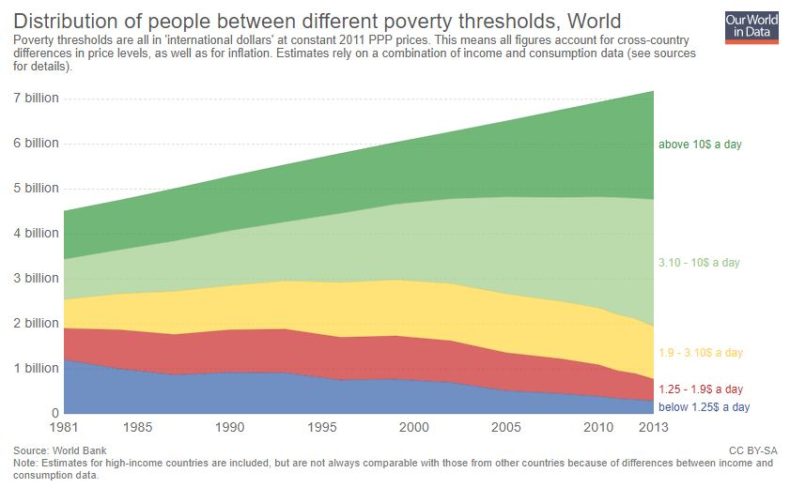
Of course someone living on marginally more than $1.90 is not suddenly free of poverty. As such, it’s very important to consider higher poverty thresholds as well. The chart below shows the number of people falling below different poverty lines. We discuss it further in this blog post. (Again you can switch between absolute numbers and percentages by clicking the ‘relative’ button. You can also look at individual countries by clicking on the ‘change country’ button.)
Given that poverty lines reflect minimum social standards, as well as aspirations and targets for improving the welfare of the poor, richer countries tend to set themselves higher poverty lines. The headline poverty figures for the rich country of Norway for example relate to a poverty line of roughly int.-$35 a day.
Whether someone lives in poverty should not depend on where in the world this person lives and this is one of the many good arguments for much higher poverty lines. Measured relative to a poverty line of int.-$35 however almost the entire world population is living in poverty and in using this threshold to measure poverty, we miss the very meaningful differences in living standards between the middle-class in mid-income countries and the world’s very poorest that are more than 20-times poorer. Yes, we should take much higher poverty lines for the world seriously, but to focus our attention on what is happening to the world’s poorest they are not helpful at all. The proposal of Lant Pritchett to rely on at least two poverty lines is a very good one.
The chart below shows the number of people living below 4 different poverty lines. By clicking on ‘relative’ below the chart you can see the proportion living below these poverty lines. We see that the proportion of people living on more than $10 was broadly flat throughout the 1980s and 90s, this century this rate has started to increase again. The rise in incomes in many Asian countries occurred largely beneath this threshold until very recently. But the fact that $10 a day represents an informative poverty threshold at all is testament to the fact that incomes across the distribution have risen. Looking back to the global distribution in 1800 we see that this was a level of income enjoyed by only a tiny proportion of the world’s population: the very richest people two centuries ago.
There is a long tradition in economics of focussing on income or consumption as a key metric. But almost everyone – economists included – would agree that other things matter too, and indeed often matter much more: good health, education, human rights, leisure time, mental health, life satisfaction, and many other aspects – the list is long.
It is because the list is so long that we are working on a very broad overview of living conditions around the world here on Our World in Data. Across our website we have more than 100 entries and show more than 3,000 other charts presenting the evidence on global living standards and the environment over time, across many, many dimensions that matter to people.
And this too is the reason why our ‘Short history of global living conditions’-chart shows six charts, each capturing a different aspect of global development over the last two hundred years. Extreme poverty is an important one, but it is shown next to other important metrics.
Whilst conceptually distinct from the economist’s notion of income, we see that many – but by no means all – of these dimensions are in fact correlated with it and, as such, have also shown dramatic improvements over the last two hundred years.
What has happened in nutrition, health and education can also be viewed as a reality-check on the extreme poverty chart. These substantial improvements in several dimensions have made each other possible and the substantial fall in extreme poverty was a key development in this aspect of global change.
This is one of my favorite infographics. A lot of people underestimate just how much life has improved over the last two centuries: https://t.co/djavT7MaW9 pic.twitter.com/kuII7j4AuW
— Bill Gates (@BillGates) January 19, 2019
What we learn from this
In considering long-run global poverty trends, people are at times too quick to present arguments on what has brought about progress, and what has undermined it. Some champion the increased role of the state, through social spending or the broader management of the economy. Others emphasise globalised trade and free markets. These debates on why this has happened are important, but they are not the same as the historical work that establishes what has happened.
In order for this discussion to be sound and helpful, we first need to know how incomes around the world have in fact changed over time. Thanks to the sustained academic research of hundreds of historians, we can. This research clearly shows that the global extreme poverty rate has fallen over the last two hundred years.
This research matters. For many – including us – ending extreme poverty is one of the most important tasks for our time and our generation. But just as with climate change, global health, or demographic challenges, any meaningful debate concerning how we should pursue this goal requires all the participants to understand the best evidence on how poverty has changed over time, and what these numbers represent. Otherwise we cannot hope to be helpful.
This article was first published on Our World in Data.
Academic literature
Overviews
A very good overview of the scientific literature is Martin Ravallion’s ‘The Economics of Poverty: History, Measurement, and Policy’
Robert Allen’s Global Economic History: A Very Short Introduction is exactly what it says. It is very well written and authored by one of the most important economic historians of our time.
A third recommendation to learn about the history of global poverty is Angus Deaton’s The Great Escape. Deaton does not only focus on the escape from poverty, but puts this development into the broader context of improving living conditions.
Recommended here is also the commentated reference list published by Pseudorasmus here.
Country or region specific research papers
If you are interested in the estimates for particular countries one starting point is “Table A2: New historical time series included in the paper” on page 36 onwards here on which the list below is based.
Peter H. Lindert & Jeffrey G. Williamson (2016) – Unequal Gains: American Growth and Inequality since 1700. From Princeton UP here.
Herranz-Loncán, A. and Peres-Cajías (2016). “Bolivian GDP per capita since the mid-nineteenth century” Cliometrica 10: 99-128
Barro, R.J. and J.F. Ursua, 2008. “Macroeconomic Crises since 1870,” Brookings Papers on Economic Activity, Economic Studies Program, The Brookings Institution, vol. 39 (1 (Spring), pages 255-350
Díaz, J.B. Lüders, R. and Wagner, G. (2007) Economía Chilena 1810 – 2000, Producto total y sectorial una nueva mirada, Pontificia universidad Católica de Chile, Instituto de Economía, Documento de Trabajo no. 315
Ward, M. and Devereux, J. (2012). The Road Not Taken: Pre-Revolutionary Cuban Living Standards in Comparative Perspective. The Journal of Economic History, 72(1), 104-132. doi:10.1017/S0022050711002452
Santamaria Garcia, A. (2005). Las Cuentas nacionales de Cuba, 1960 – 2005′, mimeo
Arroyo Abad, L., & Van Zanden, J. (2016). Growth under Extractive Institutions? Latin American Per Capita GDP in Colonial Times. The Journal of Economic History, 76(4), 1182-1215. doi:10.1017/S0022050716000954
Prados de la Escosura, L., ‘Lost decades? Economic performance in post-independence Latin America’, Journal of Latin America Studies, 41 (2009), pp. 279–307.
Bèrtola, L. and Ocampo, J. A., The economic development of Latin America since independence (Oxford, 2012).
Barro, R.J. and J.F. Ursua, 2008. “Macroeconomic Crises since 1870,” Brookings Papers on Economic Activity, Economic Studies Program, The Brookings Institution, vol. 39(1 (Spring), pages 255-350
De Corso, G. and S. Kalmanovitz (2016). Una estimación del PIB de Panamá: 1906-1945, Tiempo & Economía 3 (1).
Arroyo Abad, L., & Van Zanden, J. (2016). Growth under Extractive Institutions? Latin American Per Capita GDP in Colonial Times. The Journal of Economic History, 76(4), 1182-1215. doi:10.1017/S0022050716000954
Seminario, B. (2015). El Desarrollo de la Economía Peruana en la Era Moderna, Universidad de Pacifico, Lima
Bertola, L. (2016). El PIB per Cápita de Uruguay 1870 – 2016: una reconstruccion. PHES working paper No 48
De Corso, G. (2013). El crecimiento económico de Venezuela, Desde la Oligarquia Conservadora Hasta La Revolución Bolivariana: 1830-2012. Uno Vision cuantitativa: Venezuelan Economic Growth From The Conservative Oligarchy To The Bolivarian Revolution (1830-2012), Revista De Historia Económica / Journal of Iberian and Latin American Economic History, 31(3), 321-357. doi:10.1017/S0212610913000190
Broadberry, S.N., B. Campbell, A. Klein, M. Overton and B. van Leeuwen (2015), British Economic Growth 1270-1870 Cambridge: Cambridge University Press.
Eloranta, J., Voutilainen, M. and Nummela, I. (2016). “Estimating Finnish Economic Growth Before 1860” mimeo.
Ridolfi, L. (2016) “The French economy in the longue durée. A study on real wages, working days and economic performance from Louis IX to the Revolution (1250-1789)” Dissertation IMT School for Advanced Studies, Lucca, available at http://e-theses.imtlucca.it/211/1/Ridolfi_phdthesis.pdf
van Zanden, J. L. and van Leeuwen, B., ‘Persistent but not consistent: the growth of national income in Holland 1347–1807’, Explorations in Economic History, 49 (2012), pp. 119–30.
GDP from Grytten, O.H. (2015). Norwegian gross domestic product by industry 1830 – 1930, Norges Bank Working paper 19/2015. Population from Maddison (2006).
Malinowski, M. and Van Zanden (2017), Income and its distribution in preindustrial Poland, Cliometrica 11 (3): 375 – 404. https://doi.org/10.1007/s11698-016-0154-5
Palma, N. and J. Reis (2016). From Convergence to Divergence: Portuguese Demography and Economic Growth, 1500-1850. GGDC Research Memorandum 161
Axenciuc, V. (2012). Produsul intern brut al Romaniei, Vol. 1, Institut de Economie Nationala, Bucarest
Prados de la Escosura, L. (2017), Spanish Economic Growth, 1850-2015 (London: Palgrave Macmillan)
Krantz, O. (2017) “Swedish GDP 1300-1560 A Tentative Estimate” Lund Papers in Economic History: General Issues; No. 152.
Schön, L., and O. Krantz (2015) “New Swedish Historical National Accounts since the 16th Century in Constant and Current Prices” Lund Papers in Economic History no. 140.
Broadberry, S.N., B. Campbell, A. Klein, M. Overton and B. van Leeuwen (2015), British Economic Growth 1270-1870 Cambridge: Cambridge University Press.
Wu, Harry X. (2014), “China’s growth and productivity performance debate revisited – Accounting for China’s sources of growth with a new data set” The Conference Board Economics Program Working Paper Series
Xu, Y. Z. Shi, B. van Leeuwen, Y Ni, Z Zhang, and Y Ma, (2016) ‘Chinese National Income, ca. 1661-1933’, Australian Economic History Review 57(3), 368–393.
Broadberry, S.N., Custodis, J. and Gupta, B. (2015), “India and the great divergence: an Anglo-Indian comparison of GDP per capita, 1600–1871” Explorations in Economic History, 55: 58-75
Pamuk, S. (2009). “Estimating GDP per capita for the Ottoman Empire in a European Comparative Framework, 1500-1820”, paper presented at the XVth World Economic History Congress, August 2009, Utrecht.
Barro, R.J. and J.F. Ursua, 2008. “Macroeconomic Crises since 1870,” Brookings Papers on Economic Activity, Economic Studies Program, The Brookings Institution, vol. 39(1 (Spring), pages 255-350.
Pamuk, S. (2006), Estimating Economic Growth in the Middle East since 1820, The Journal of Economic History, vol 66, no. 3, pp. 809 – 828.
Fourie, J. and Van Zanden, J.L. (2013). GDP in the Dutch Cape Colony: the Nationals Accounts of a Slave-Based Society, South African Journal of Economics, vol. 81 (4): 467 – 490
CapX depends on the generosity of its readers. If you value what we do, please consider making a donation.
