It’s tempting and easy to discuss social mobility in terms of class or ethnicity. This is particularly true in the United States, where outcomes all too often appear contingent not just on which area you grow up in, but the colour of your skin.
Social mobility is an issue of particular cultural salience, given the continuing attachment to the idea of an American Dream. The idea that anyone who works hard can get on in life is deeply ingrained into the American psyche, though in the poorest parts of the country it must often seem like the stuff of fantasy. Unsurprisingly for a vast but also highly devolved country, the factors influencing an American child’s life chances are complex and highly localised.
Just how localised becomes clear when you examine the Opportunity Atlas, a project undertaken by a group of US economists, including Harvard professor Raj Chetty, to understand just what is going on in different parts of their country.
It’s easy to bandy around superlatives, but this truly is an awe-inspiring piece of work. It’s not just the scale of the Atlas – built using data from a cohort of 20 million Americans in their mid-30s – but the granular details that make it so fascinating. The researchers achieved this fine detail by parcelling up the entire US by census tracts — 70,000 units of land comprising just 4,200 people each – to create a pointilliste portrait of the nation.
The Atlas works in a number of ways, but the researchers’ main aim was to track how this cohort of Americans progressed as they got older, and what that said about the areas they grew up in. As well as drilling down geographically into tiny sections of the population, the Atlas lets you see what differentiates those areas based on all manner of different indices – race, employment, marriage rates, single parents, educational attainment and so on.
It is both fascinating in its own right and a starting point for any number of new pieces of work on poverty and prosperity in the States.
For a taste of what the Atlas offers, consider the diagram below, showing incarceration rates for black men in Los Angeles. People who grew up in the red areas have the highest rate, the dark blue the lowest. In 2010, black men from Watts had an incarceration rate of 44 per cent. If you grew up a couple of miles down the road in Compton, the rate was a mere 6.2 per cent (still very high indeed by the standards of a developed country).
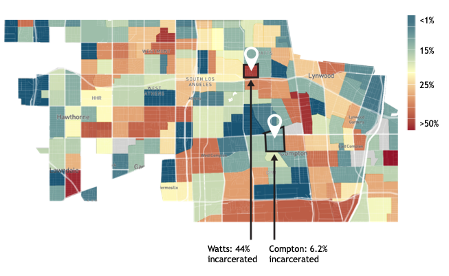
So while it’s undoubtedly true that black men are hugely overrepresented in the US prison system, a deeper dive makes it clear just how crucial neighbourhood is in determining whether someone will end up behind bars.
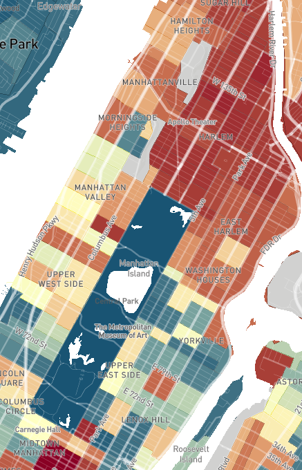
Or look at this snapshot of Manhattan — things seem simple enough, with chronic poverty starting where Central Park ends in the predominantly black neighbourhood of Harlem.
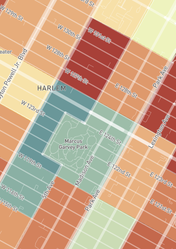
Look a bit more closely though, and even within apparently poor Harlem there are big disparities, sometimes literally depending which side of the street you grew up on. The snapshot below, for instance, shows the different average income for black men from the area. For those raised in the red rectangles the median income is just $15,000 a year, while the other side of 125th Street the same figure is $31,000.
This is not necessarily a huge revelation — anyone who has spent time in a big city will have noticed poverty and wealth living cheek-by-jowl. But it is a reminder of how futile it can be to generalising about groups of people or places.
As the researchers put it:
Many think of neighbourhoods as either “good” or “bad” for everyone. But, we find that outcomes can differ sharply across people who grow up in the same neighbourhoods. Returning to the example above, Hispanic men who grew up in Watts have an incarceration rate of 4 per cent – an order of magnitude smaller than for black men raised in the same tract.
Outcomes also differ by gender: in Watts, low-income black women grow up to earn three times as much as low-income black men. These differences show that we should not think of neighbourhood quality – or the policies that might improve it – as “one size fits all”. It may be more impactful to design policies that target specific sub- groups in ways that directly address the particular challenges they face.
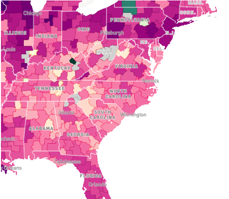
At the same time, a zoom out can also be revealing. Look at the map below of the eastern United States, where purple represents areas where low-income white men earn more than low-income black men. That one green area at the top is the only bit where low-income black men outperform their white counterparts. Bearing in mind local differences, the swathes of purple show pretty clearly that upward income mobility is significantly enhanced by being white.
These are just a few snapshots from this extraordinarily useful tool. From planning new housing, to offering school vouchers or tax credits, it’s not hard to see the myriad applications for policymakers looking for insights on how to help those on the lowest rung get a shot at the American Dream.
