Angus Deaton, the Nobel-prize winning economist (who also sits on the advisory board of HumanProgress.org), recently reiterated his belief that on the whole the world is getting better – if not, as he accepted, everywhere or for everyone at once.
Perhaps that comes as no surprise to regular CapX readers, but the idea that the world is getting better in regards to poverty is actually a deeply unpopular view.
Ask most people about global poverty, and chances are that they’ll say it is unchanged or getting worse. A survey released late last year found that 92 per cent of Americans believe the share of the world population in extreme poverty has either increased or stayed the same over the last two decades.
Americans aren’t alone in that belief. Across all surveyed countries, an only slightly smaller majority – 87 per cent – believe that extreme poverty has risen or remained an intractable problem.
There are a number of cultural and psychological explanations for the persistence of such pessimism. Bad news makes for good headlines, and tends to dominate media coverage. Psychologically, people tend to idealise the past, recalling dramatic and unusual events more easily than steady long-term trends. They may also use pessimism as a means of virtue signalling.
Indeed, of those rare people who realise that extreme poverty has declined, almost all underestimate the extent of that decline. In fact, global poverty has halved over the past 20 years – but only one person in 100 gets it right.
Unsurprisingly, people in areas that have seen the most dramatic reductions in poverty are the most likely to be more aware of what’s really going on. But even in China, where hundreds of millions of people have risen out of destitution over the last four decades, half of the population remains ignorant of the broader collapse in world poverty that has occurred within their lifetimes.
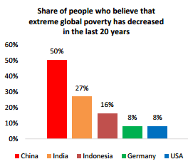
Source: Glocalities Global Poverty Survey by Dutch research firm Motivaction
To help bridge the gap between public perceptions and reality, here are five charts, based on data we’ve collected at HumanProgress.org, that illustrate the extraordinary progress humanity has made.
Throughout most of human history, extreme poverty has been the norm. This famous hockey-stick chart, arguably the most important graph in the world, illustrates what happened when the Enlightenment and Industrial Revolution caused income to skyrocket – forever changing the way we live, and perhaps even the way we think.
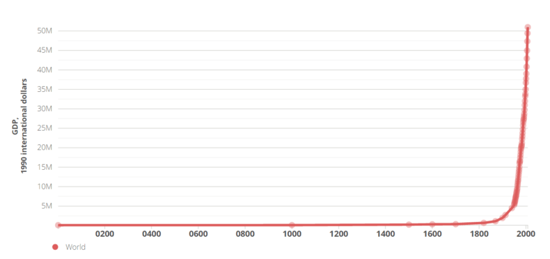
Humanity, as this chart shows, produced more economic output over the last two centuries than in all of the previous centuries combined. And this explosion of wealth-creation led to a massive decrease in the rate of poverty.
In 1820, more than 90 per cent of the world population lived on less than $2 a day and more than 80 per cent lived on less than $1 a day (adjusted for inflation and differences in purchasing power). By 2015, less than 10 per cent of people lived on less than $1.90 a day, the World Bank’s current official definition of extreme poverty.
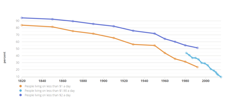
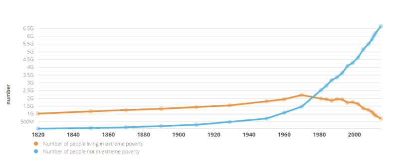
Not only has the percentage of people living in poverty declined, but the number of people in poverty has fallen as well – despite massive population growth. There are also more people alive who are not in penury than there have ever been.
From 1820 to 2015, the number of people in extreme poverty fell from over a billion to 700 million, while the number of people better off than that rose from a mere 60 million to 6.6 billion. (Extreme poverty is again defined here as living on $1.90 a day, adjusted for inflation and differences in purchasing power.)
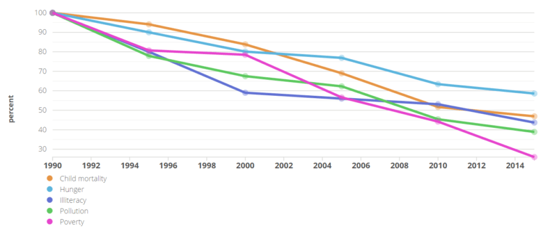
Globally, poverty is about a quarter of what it was in 1990. And the graph below from Johan Norberg’s excellent book, Progress: 10 Reasons to Look Forward to the Future, illustrates how the decline of extreme poverty has raised living standards and brought about other tangible improvements.
As poverty has lessened, so have child mortality, illiteracy, and even pollution in wealthy countries – all are now less than half of what they were in 1990. Hunger has also become much rarer. You can learn more about how increased prosperity has led to progress in other areas by watching this video from a forum inspired by Norberg’s book.
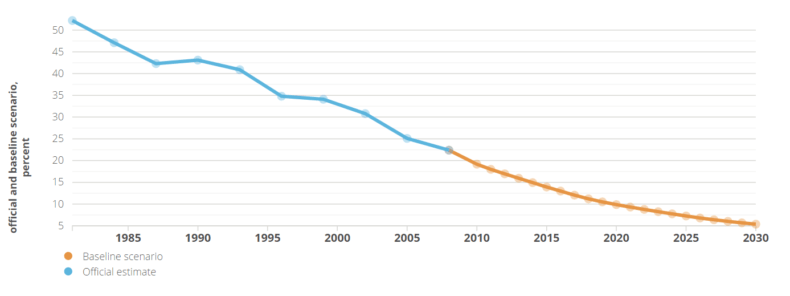
If progress continues on its current trajectory, the Brookings Institution estimated in 2013 that extreme poverty (this time defined as living on $1.25 a day, again adjusted for inflation and differences in purchasing power) will all but vanish by 2030, affecting only 5 per cent of the global population. This is what they considered to be the “baseline” or most likely scenario. In the best-case scenario, they predicted that by 2030 poverty will decrease to a truly negligible level, affecting only 1.4 per cent of the planet’s population.
The facts are unambiguous: despite public perceptions to the contrary, extreme poverty has declined significantly, to the point where its end may actually be in sight.
So next time you hear someone bemoaning a supposed rise in world poverty, encourage them to have a look at the evidence for themselves.


