Well, this is awkward.
For the last few months, the hottest thing in economics has been the “elephant chart”. Produced by economists Christoph Lakner and Branko Milanovic, it showed how global income has changed over the past 20 years.
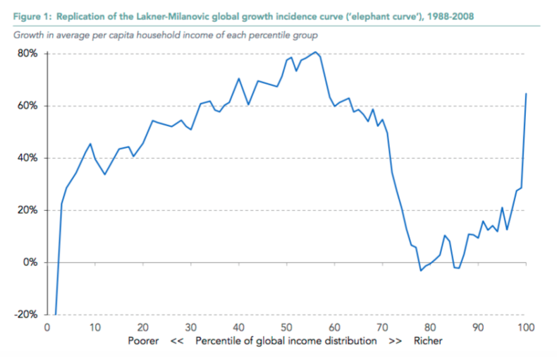
The chart shows the poorest people in the world on the left and the richest on the right. The great hump in the middle is the huge wealth dividend in Asia – and especially China – driven by trade and globalisation. The spike on the right is wealthy Westerners getting their cut. And the alarming dip in the middle, which gives the elephant its shape, is the lower and middle income voters of Britain, America and Europe, suffering under the pressure of foreign competition and becoming increasingly attracted to those politicians – your Donald Trumps and Nigel Farages – who promise to make it go away.
The elephant chart was a sensation because it felt right. It seemed to provide the simplest and clearest explanation of what we all seemed to observe around us. That’s why it was been called “the most important chart for understanding politics today” by the Washington Post and “the chart that explains the world” by the Financial Times. Indeed, when I talked in my introductory piece for CapX about the need to make capitalism work for everyone, it was the elephant chart I had in mind.
Except, it turns out, that the elephant chart is a myth.
That, at least, is according to a new analysis by Adam Corlett of the Resolution Foundation, the London-based think tank (who produced all the charts I’ve used in this piece). They argue that the Lakner/Milanovic chart is accurate on its own terms, but is distorted by various factors, such as changes in the countries being considered, differing population growth within countries – and the fact that some countries have done very much better than others (in particular, China), and some have done very much worse.
Here, for example, is a chart – using the same data – of how well Western countries have done compared to the rest of the world, with Japan (with its long depression) and the post-Soviet states (whose economies went through a wrenching period of readjustment in the early 1990s) stripped out.
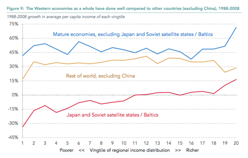
Yes, the rich still do better. But even the poorest within the Western countries are still growing richer at a pretty decent clip – quicker, in fact, than the global average once China is excluded. (Although admittedly, calculating global economic statistics without China is kind of like making pizza without the tomato and cheese…)
Here, for example, are the figures for income growth from Britain – again, there are variations, but no one’s being left completely behind.
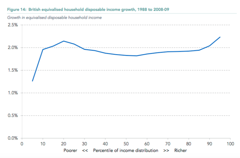
So how did the elephant narrative, of boom for the rich and stagnation for the rest, take wing? The RF report suspects that it has to do with America – where income growth for the lower and middle classes has indeed been lower than in Britain and Europe, averaging approximately 1 per cent a year rather than 2 per cent.
But even there, they point out, the real message is not one of stagnation – just of stagnation relative to those higher up the income scale.
What does this all mean? Put bluntly, that capitalism – and in particular free trade – has worked and is working. As the RF say, under their revised methodology China’s growth looks even more impressive. What disappears is the nasty Western dip that appeared to be its inevitable price.
Globalisation, in other words, is not a steamroller that will inevitably crush millions of livelihoods: it is a broadly positive force, and one whose impact can be directed and channelled by the decisions countries make. Obviously, it imposes costs: Britain doesn’t have much of a mining or steel industry these days, for example. But these are specific problems rather than symptoms of a general malaise.
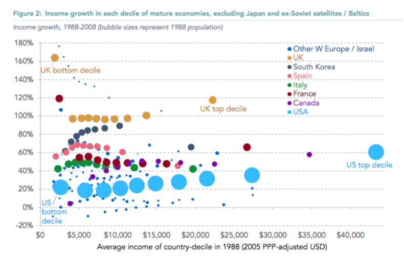
Here, for example, is the RF’s chart of how well different Western countries have done in the last 20 years. What stands out to me – apart from the relative stagnation of the USA – is Britain’s performance (the mustard-coloured dots). This was the period in which our economy became more flexible, liberal and open than ever, as we reaped the rewards of Thatcher’s structural reforms and the broad acceptance of her economic settlement by those who came after her. We went from being the sick man of Europe to one of its powerhouses – outpacing those European rivals who remained sceptical, even hostile, towards the free market. And yes, the richest come out slightly better than the rest, apart from the very poorest (presumably due to increased welfare payments or the introduction of the minimum wage?). But the cake grew for everyone.
This is not to paint an entirely rosy picture. Globalisation does create losers as well as winners, even if their numbers are not as great as was feared. Income inequality is still a very real issue. There has been a widespread and concerning collapse in productivity growth (see chart below). And changes to the labour market driven by technology could have all sorts of consequences, including driving further increases in inequality.
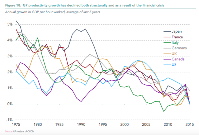
But still: if the RF’s critique of the elephant chart is right, the message is that the great triumph of capitalism in recent decades – the lifting of millions of Asians out of poverty – was just as impressive an accomplishment as we previously believed, and that it came at far less of a cost to those in developed nations: indeed, that they benefited in the process. What better case for free markets could there be?

